New Midland Group
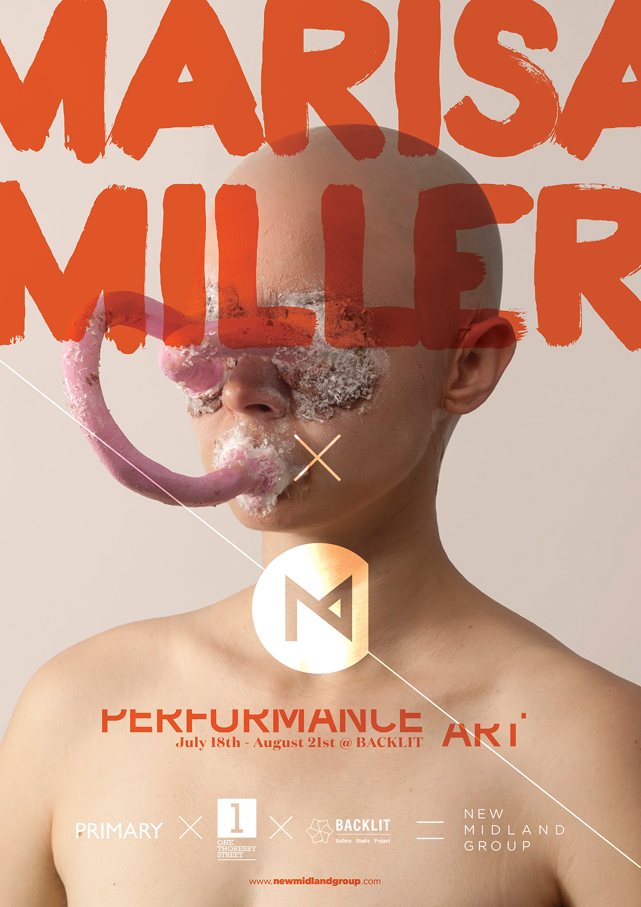
An initiative by three of Nottingham’s leading art galleries (Backlit, Primary, and One Thoresby St), the New Midland Group was set up to be the Avengers of the local art scene – a collective that pulls together to tackle the exhibitions and art programming that no individual gallery can.
The identity needed to fulfil a tricky dual role – be creative enough to appear ‘authentic’ to the great and good of the East Midlands art scene, but also serious enough to appeal to investors and patrons. With two such opposite demographics, clearly this was going to be no easy task.
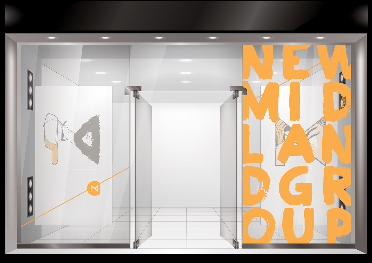
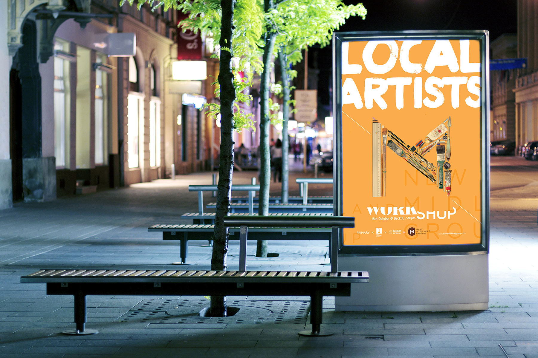
To that end, we devised an adaptable icon that was rarely in the same state for too long. At it’s heart, it’s just a simple line comp of an ‘N’ and an ‘M’ in a circle a with distinct vertical cut.
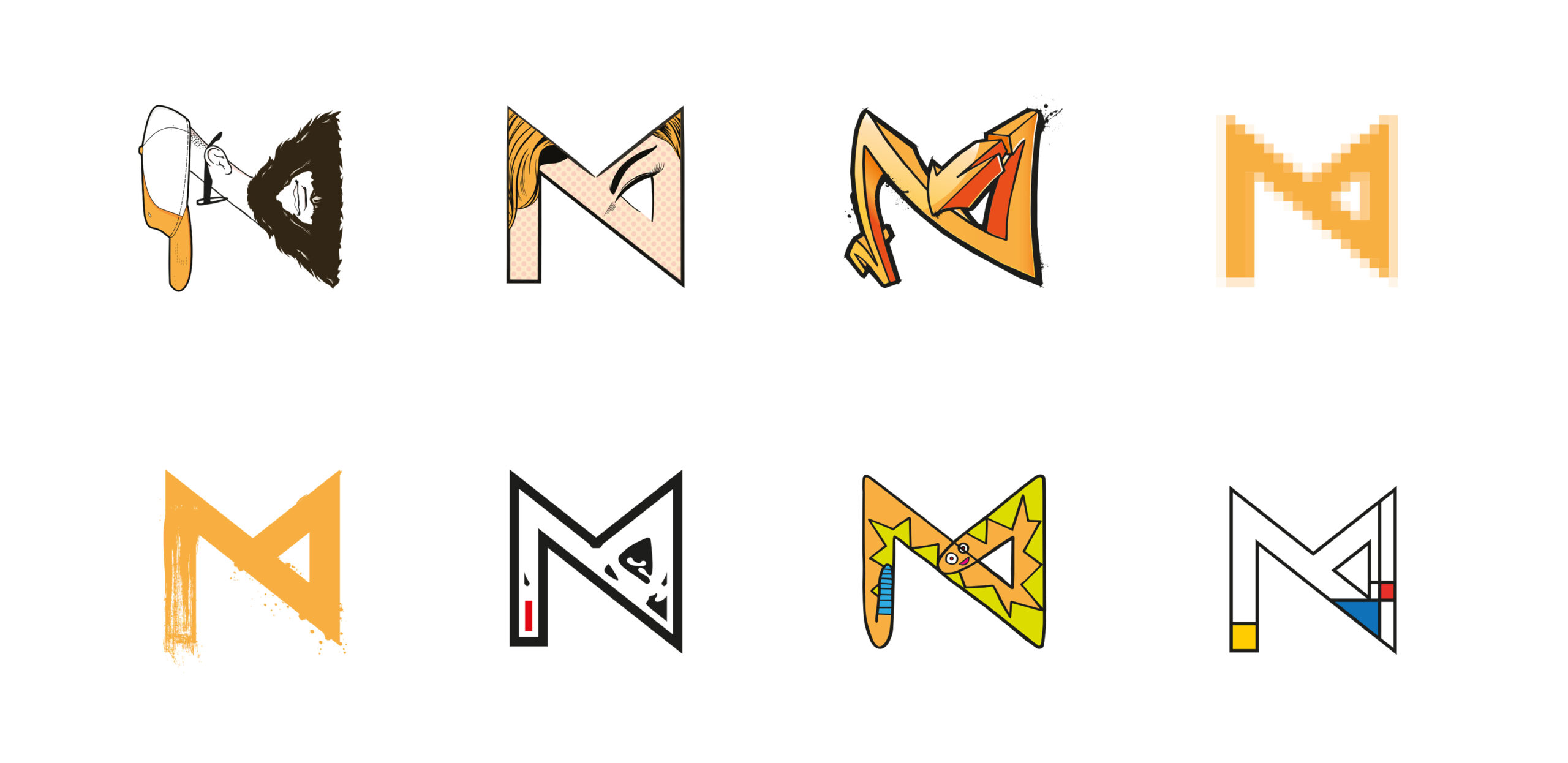
This primary configuration is there to establish the base identity. But the overall plan is to constantly produce more and more variants of the icon in different art styles, both historical and contemporary.
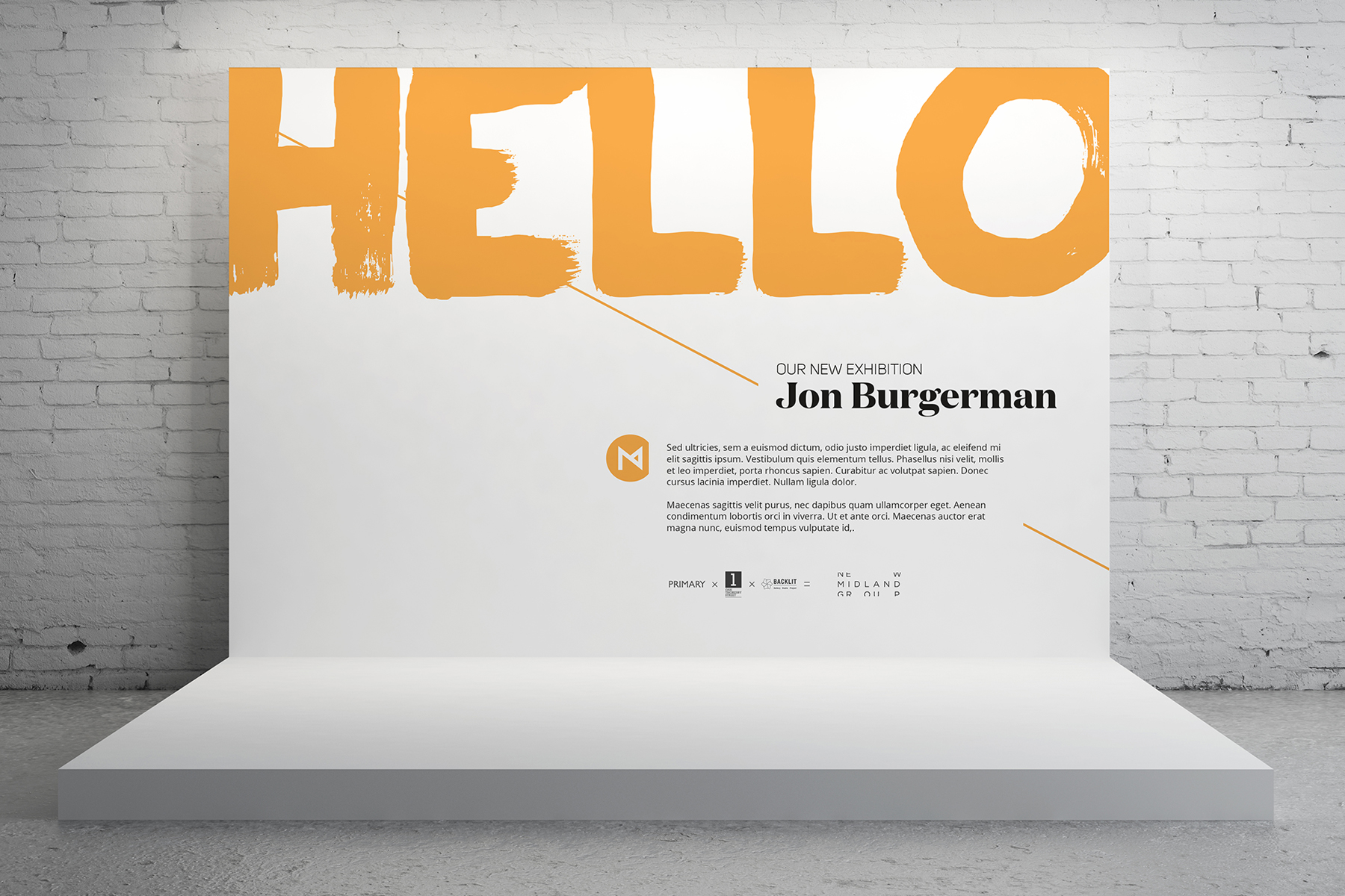
This approach gives it an adaptable, playful personality. Art is different to different people; giving them a variety of different styles gives them one to latch onto as well as well as embodying the variety of programming NMG does.
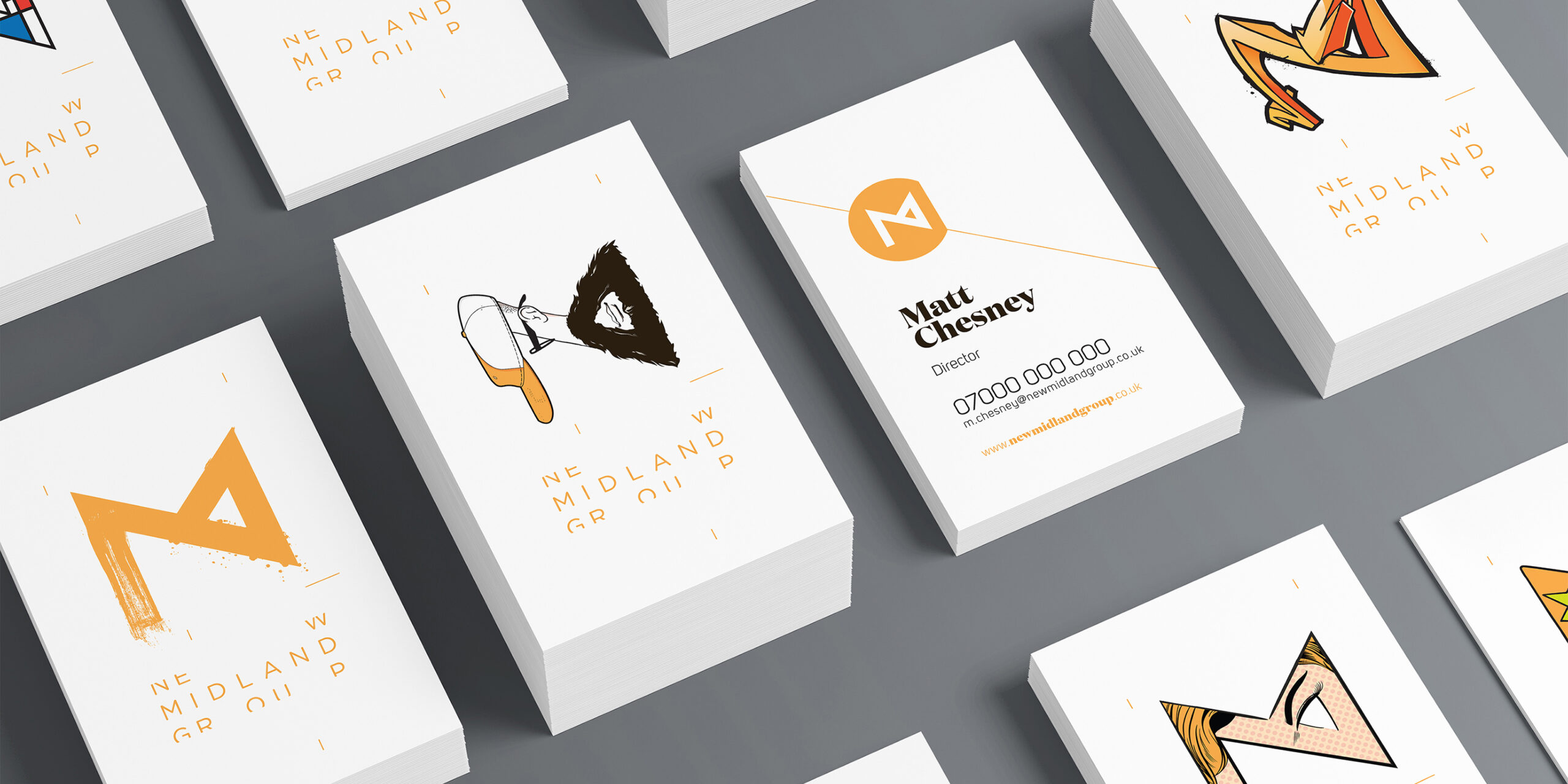
“These designs stood head and shoulders above the other applications. We were really impressed with Secret’s ability to create multiple design options from one principle logo. We were also excited about how transferrable the designs could be and how well they could work in future New Midland Group campaigns.”
New Midland Group
