Tamatanga
This work was undertaken for Adtrak.
Branding can often be like raising a child. You start off trying to get them to walk on their own two feet and find their own voice. You put a little of your own principles in them and you watch as their own personality comes out. When it’s time for them to go out into the world on their own, you hope that you’ve raised them right and given them enough to survive in the world… and then they come back to you with their hand’s outstretched asking for more.
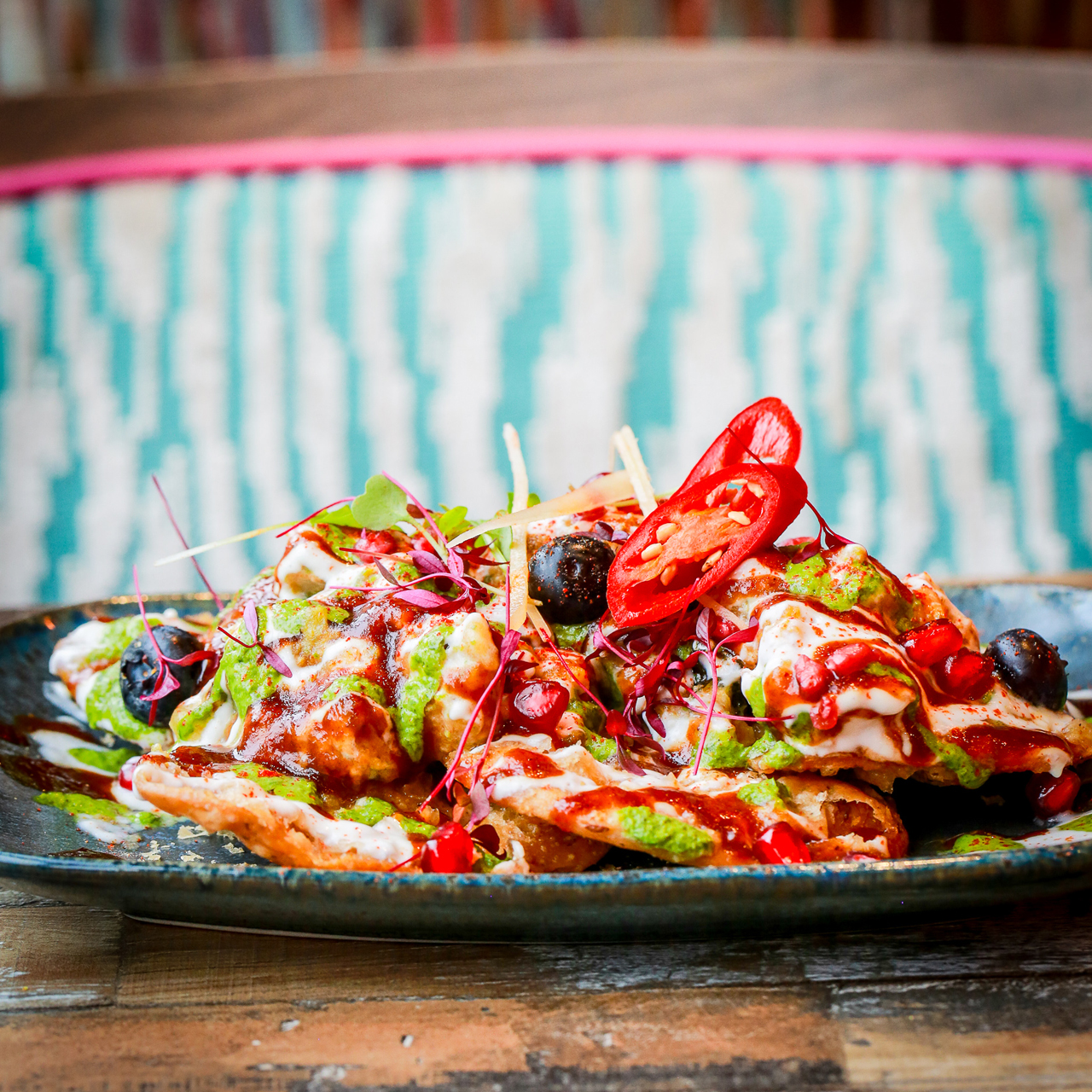
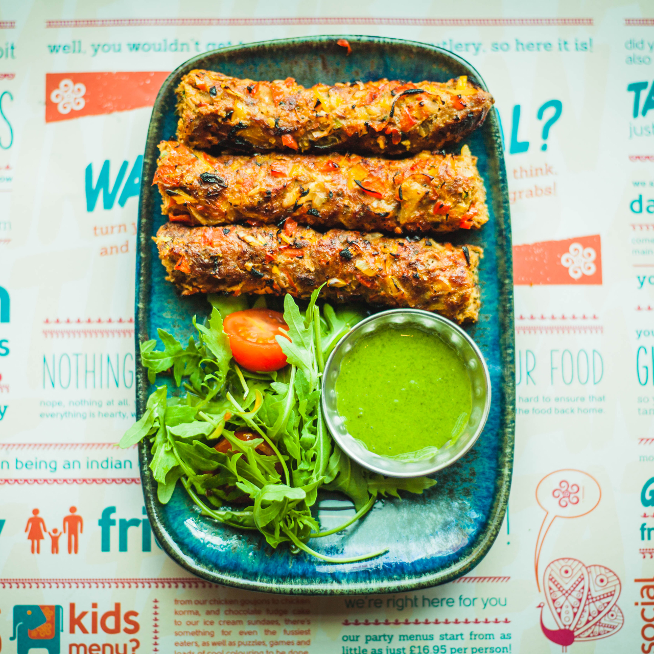
Tamatanga is a UK-based restaurant chain, specialising in urban Indian food. Their brand has always been about avoiding the clichés of traditional Indian restaurants, both in their appearance and their cuisine; they’re about delicious, modern dishes in a fun, youthful setting.
We had the pleasure of first working on their brand in 2013, and then late last year we got the opportunity to update the brand again.
Updating the Brand
In 2013, the rebrand was about creating an identity system that added some much needed consistency as well as more personality.
This most recent exercise was about adding more vibrancy and youthfulness to the brand.
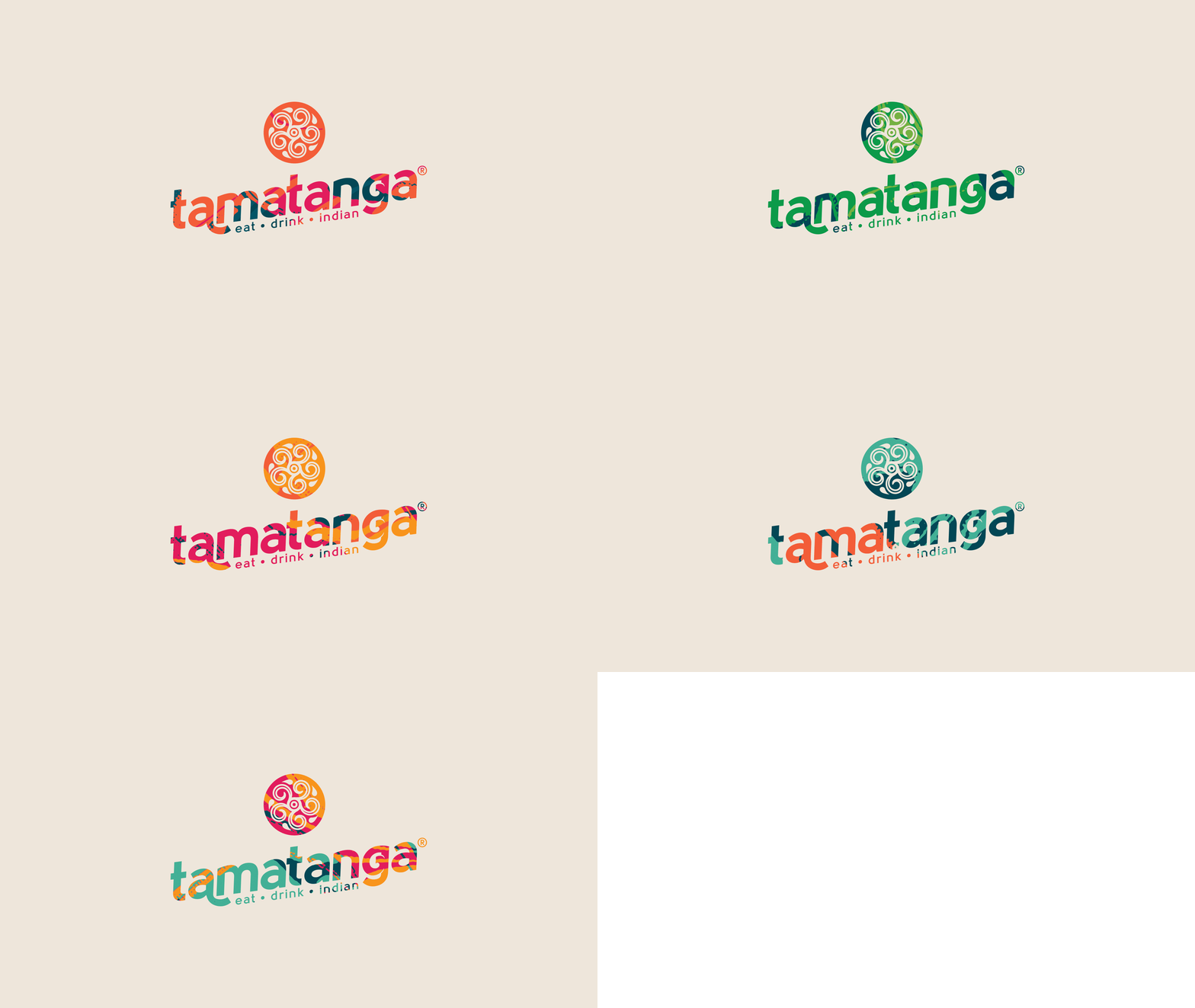
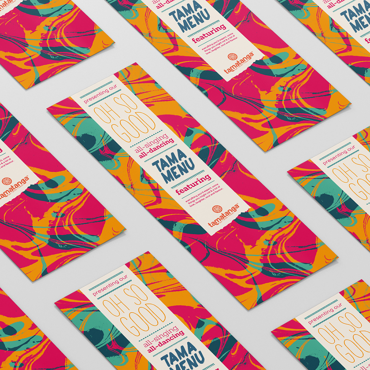
The main logo had a slight change in configuration, but the most drastic change was with the use of colour and pattern. The previous version of the brand used intricate Indian patterns constrained to geometric shapes (spots, chevron lines, diamond squares etc), and predominantly in natural paper colours, leaving the sparing use of bright colour to draw attention to information and sales lines.
2008 Logo
2013 Logo
2017 Logo

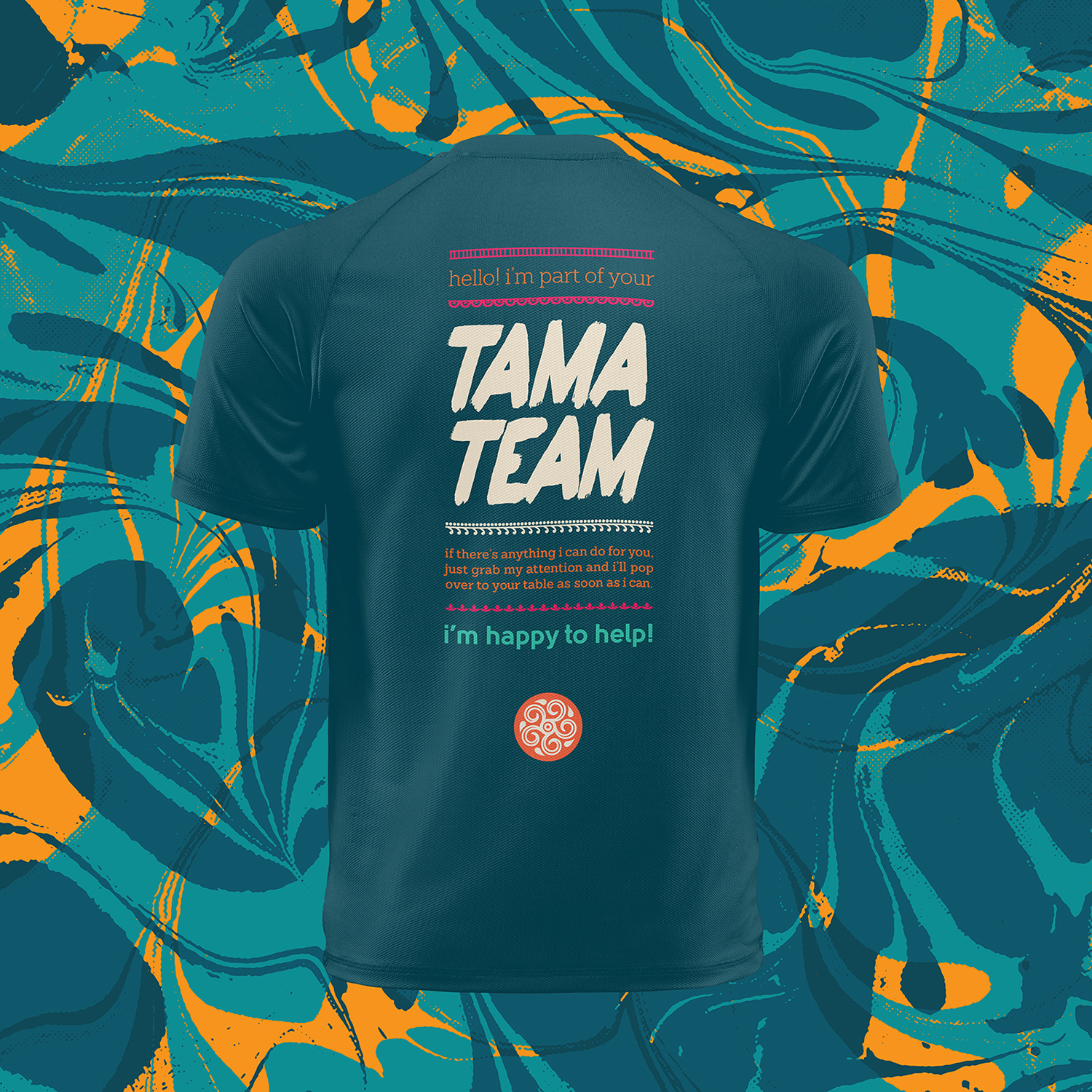
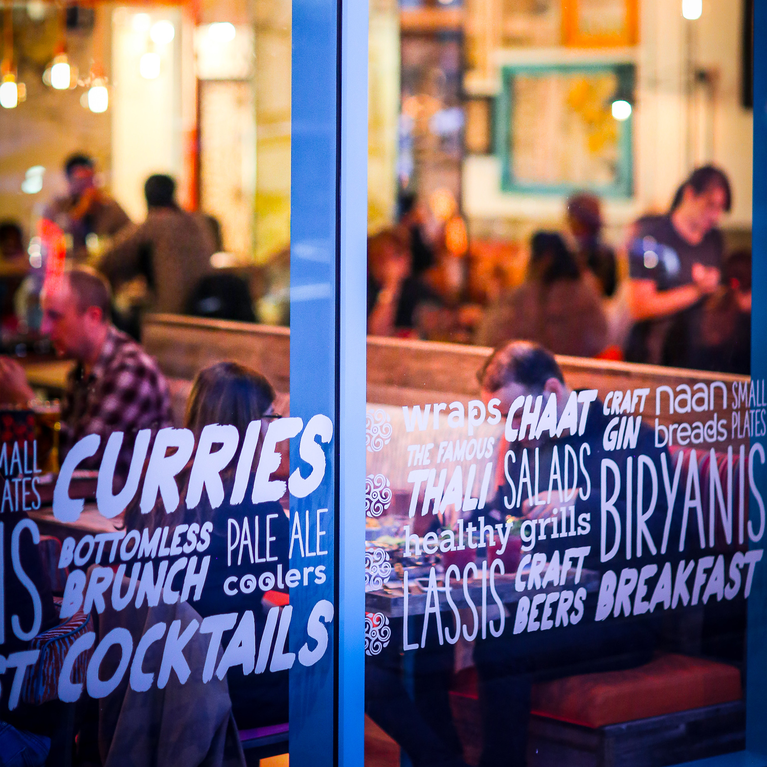
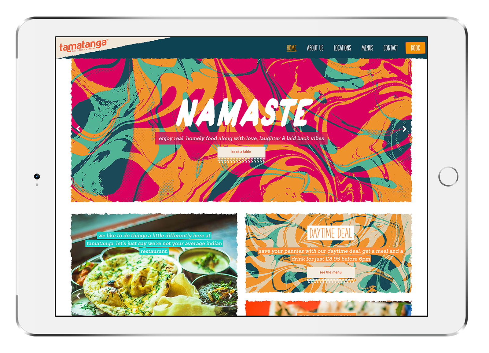
With this version, we used more natural-feeling oil patterns with a slight distressing, and applied bright colours from the Tama palette. After that we then used clean space to pull attention to carried content.
The brand covered usage over a variety of marketing channels, both online and offline, as well as the front-of-house, point-of-sale, staff uniforms, and of course the new website.
This new version of the brand was launched via their new Birmingham branch, and was well received by both the local population and local food bloggers.


